A Design-Led Transformation:
Make Reporting Holistic & Measurable
Set up the foundations for holistic measurement. Designs went first to shape the product decisions — the redesign drastically improved reporting efficiency and identified high-value opportunities for subsequent phases of the report tooling.
Foundations for Holistic Measurement
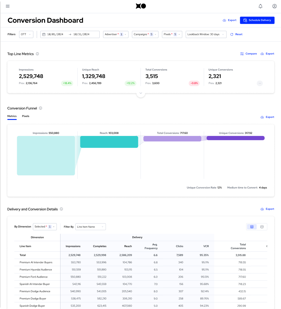
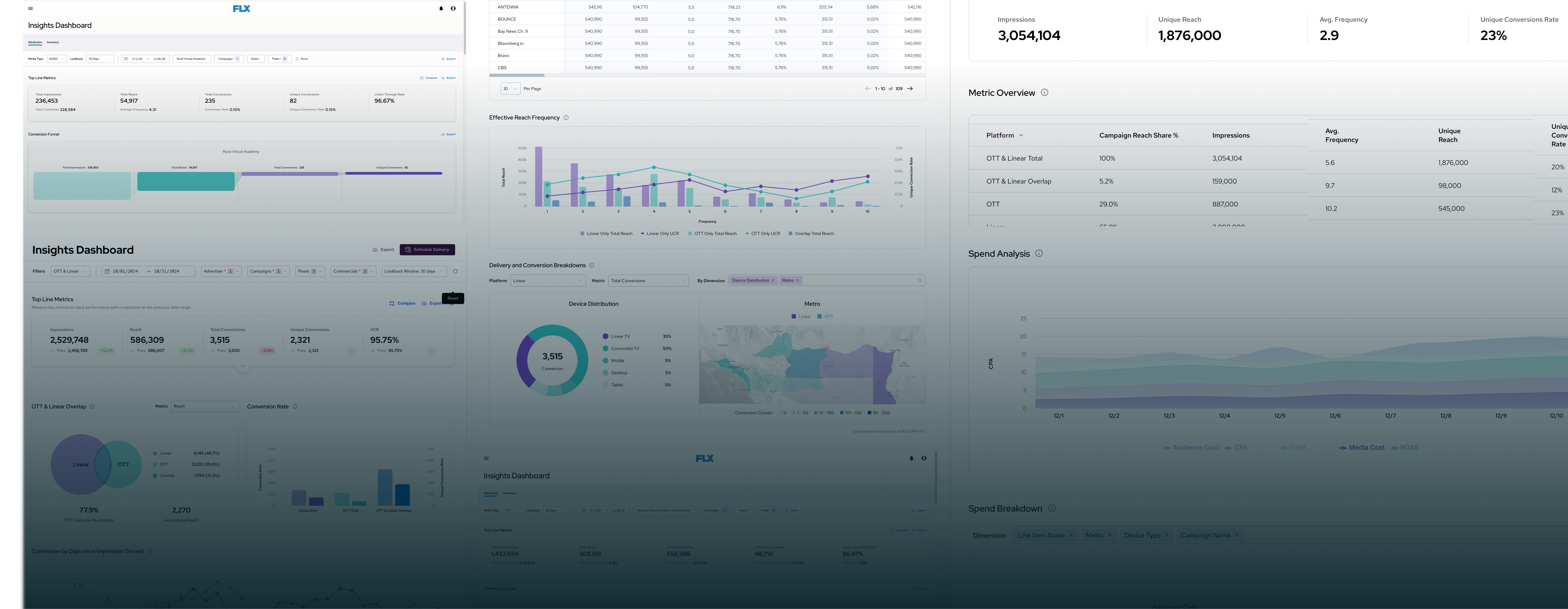
As the design lead, I drove this project end-to-end — shaping product decisions and securing its priority as a P0 initiative. The new design drastically improved reporting efficiency, cutting the time required to build a report by up to 95% while handling 23 dimensional cuts, 30+ metrics, filtering, and scheduled deliveries. It established a design foundation and framework for the larger reporting tool refactor — and identified the high-value opportunities that shaped subsequent phases.
Conversion: Critical but Painful to Calculate
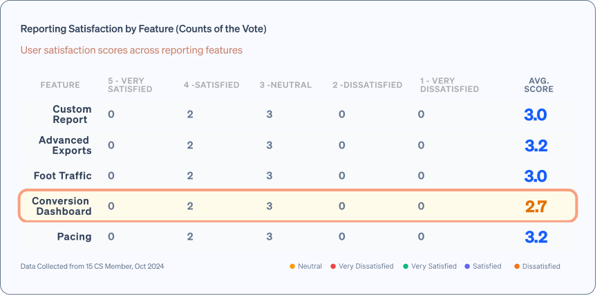
Conversion reporting is critical for our largest clients — station groups and agencies — to track how effectively their campaigns drive user conversions. But user satisfaction was consistently low: poor CSAT scores and steady feedback about inefficiencies.
Instead of leveraging the dashboard, users were downloading raw data and manipulating it elsewhere — a clear signal that the tool was failing the people it was built for.
Evaluating Looker & Many Design Explorations
The company’s major initiative was migrating all reporting functionality to Looker — under significant performance pressure. Through cross-functional workshops with PMs, engineers, and customer success, I presented design sketches and user research findings alongside revenue impact projections.
My design-first approach successfully advocated for a Looker API integration with our own design system instead of the proposed iframe solution. I positioned this as enabling real-time data exploration and storytelling — and that perspective shift drove the entire reporting product strategy.
Design Foundations that Drove Product Decisions
The redesign delivered transformational results across every metric. CSAT jumped from 2 to 5 out of 5. Report generation time dropped from 5–20 minutes to under one minute. Within two months, 50% of users migrated completely to the new dashboard.
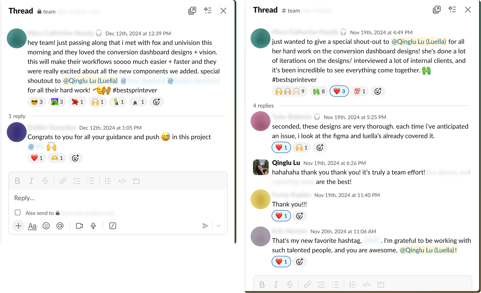
Our largest clients provided testimonials that became central to sales pitches. The redesigned dashboard became the cornerstone of the Reporting team’s 2025 business strategy, and the design established the foundation for all upcoming dashboards.
Due to NDA restrictions, I cannot share further progress or visuals for this project.
Please feel free to contact me: qinglu.design@gmail.com
Or discover inventive designs, creative solutions, and successful collaborations that demonstrate my knowledge and enthusiasm for AI, DataVis and more.