98% of them specify that decision making requires a lot to combine
"a lot to consider, Color pallet, print, silhouette, pattern directions. struggling on determining product features."

Pendulum, a trend analysis platform enable fast fashion businesses to make product decisions accurately and efficiently
Transforming traditionally cumbersome excel tables into a powerful tool, Pendulum has iterated through a lot of validations, and explorations to develop this end-to-end market trend analyzing experience.
Impact of our dashboard's design incorporates:

Can you tell which of this handbags is popular in the market?
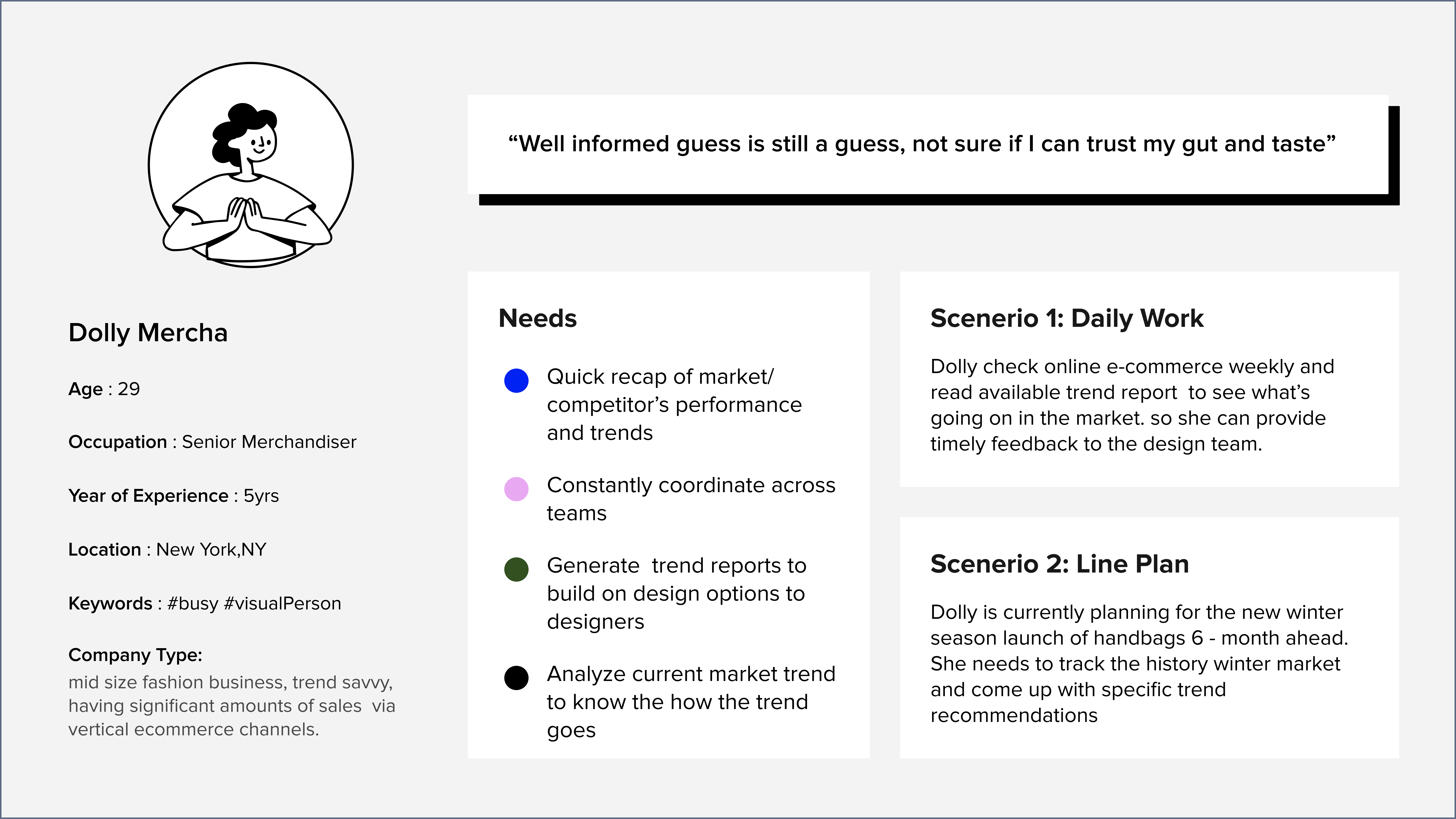
Like you, merchandisers from the fashion industry also often wrong. In order to succeed in a highly competitive fast fashion industry, it is not the job of the fashion designer that makes decisions. There is a role of merchandisers, who are asked to monitor the market trend and provide quick feedback (to designers or marketing)

Merchandisers spend a lot of time housekeeping.Among all the tasks, merchandisers market analysis is the most time-consuming, taking on average 5-10 hours weekly. his number will be even higher if they do line planning for each season six months in advance.

For Merchandisers who work for small to medium-sized fast fashion companies, there is a need for a efficient and customizable method to monitor market trends. because the current manual research is very time-consuming, and is polluted by too much market noise to put together actionable insights

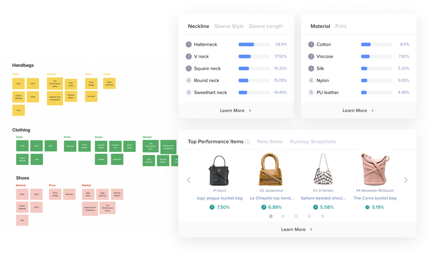
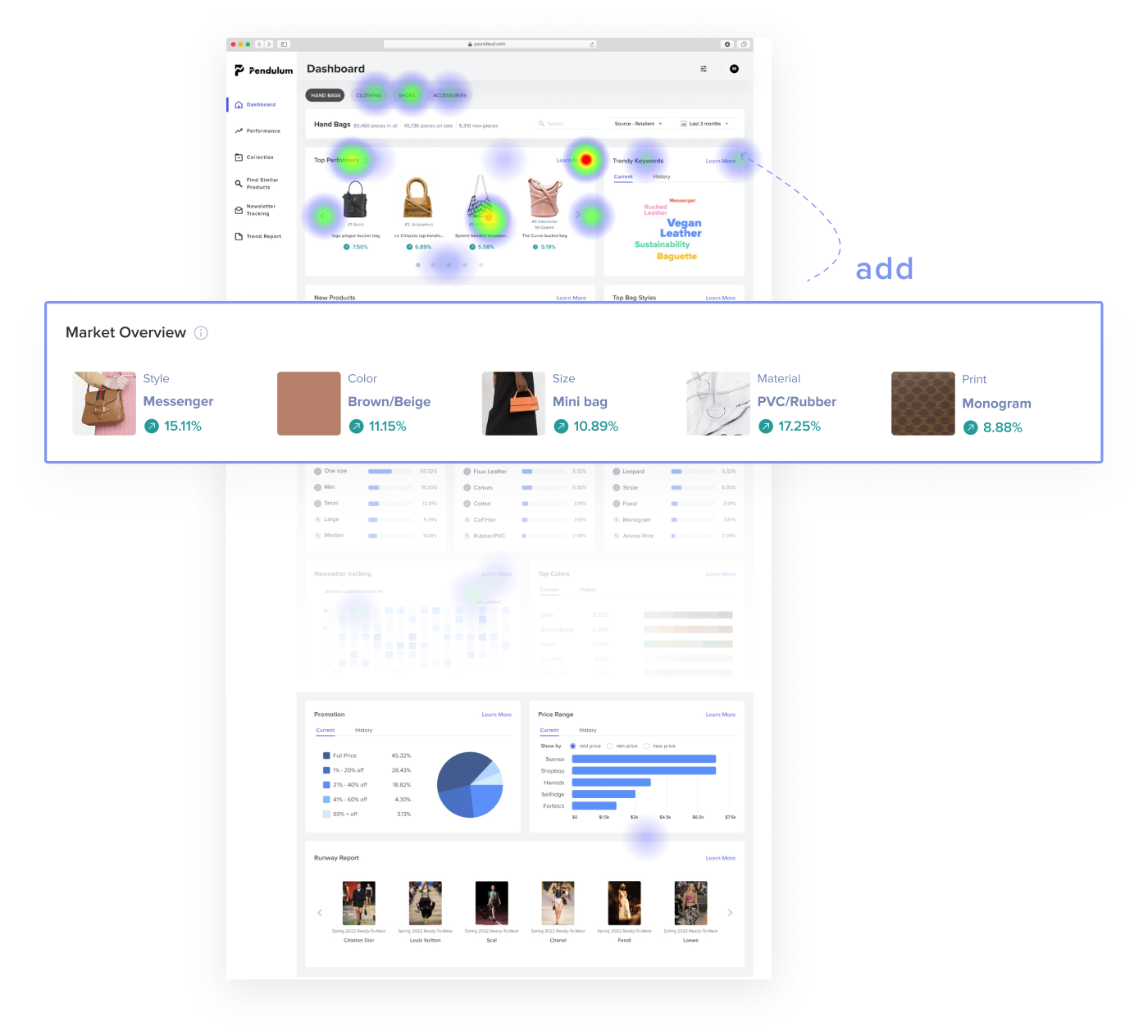
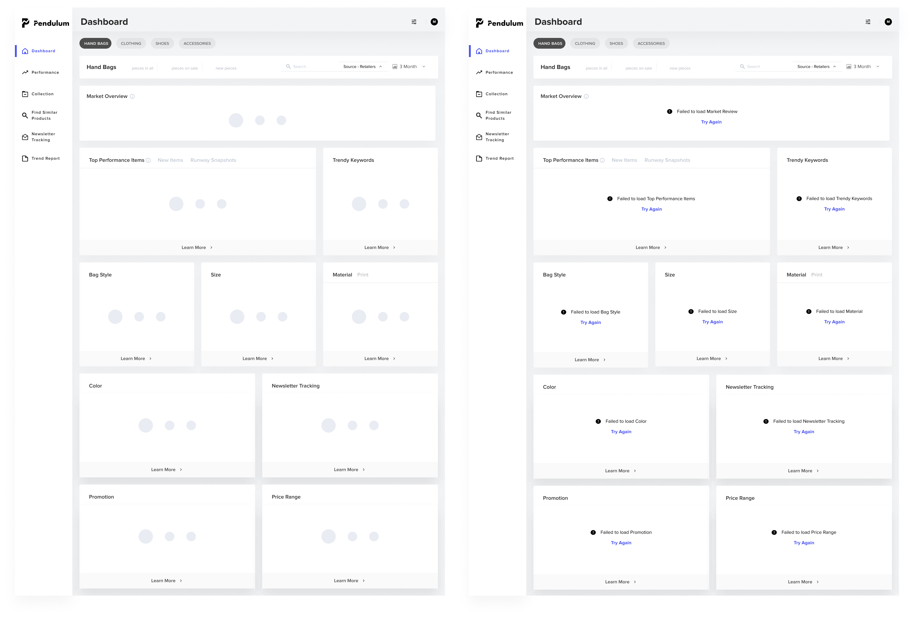
It provides a comprehensive market overview to merchandisers by presenting a number of metrics in a comprehensive manner.
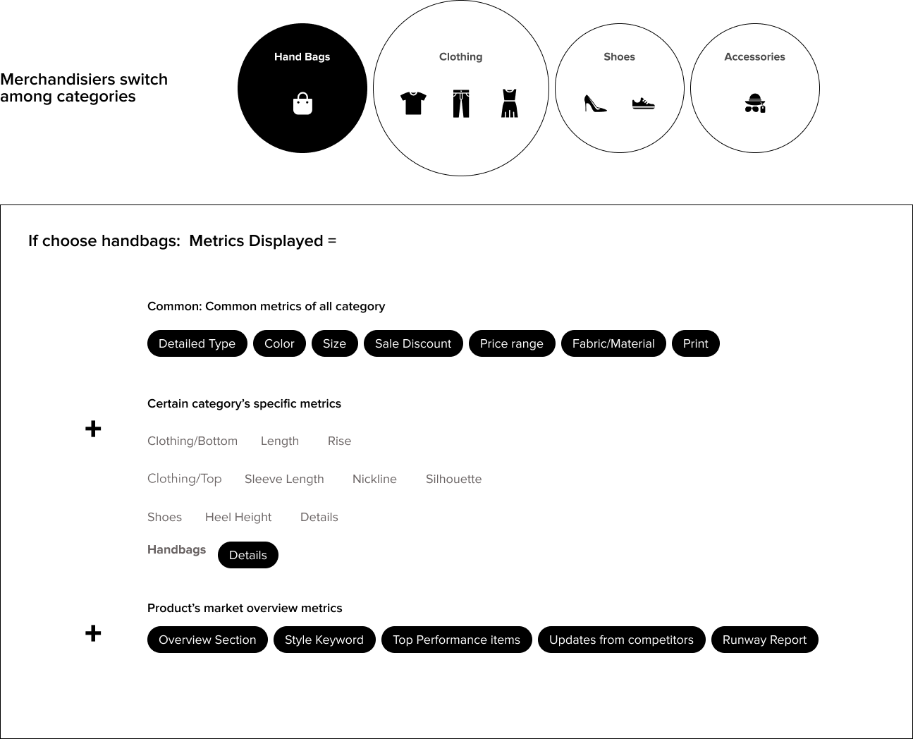
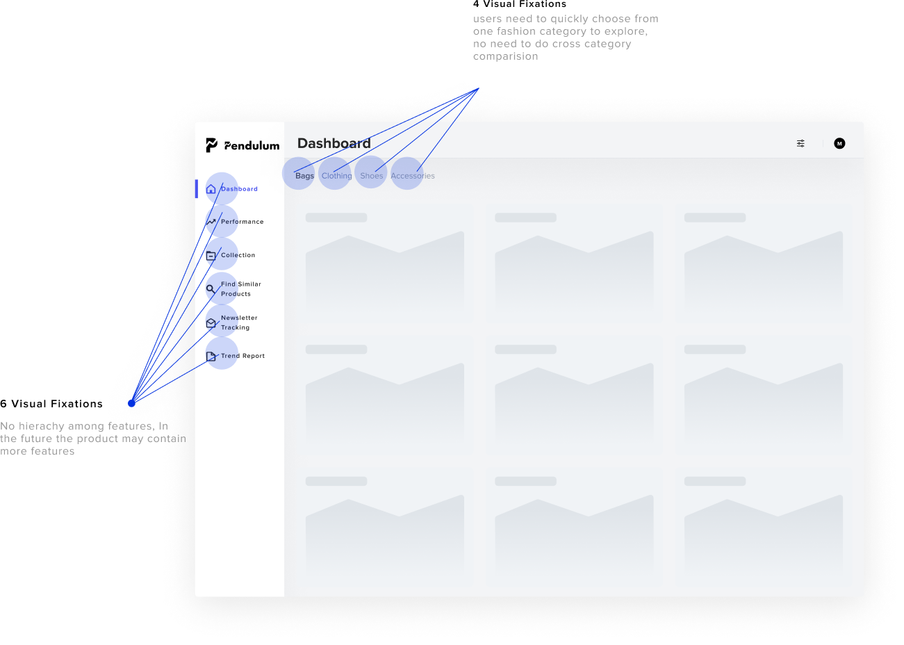
Switch freely between different categories, each with its own different metrics, effectively exhibiting in the dashboard
After selecting the metrics of interest, you can click on them to see the historical development trends and customize the options to suit your needs.

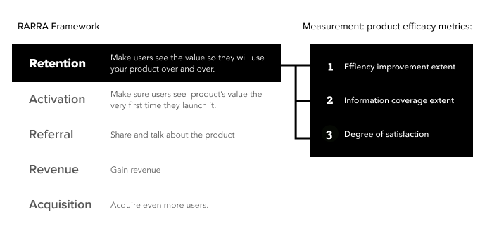
After zooming in the to focus on competitive market research, Our design team had meetings and QA sessions with all stakeholders to clarify current business needs: For start-up Saas products, retaining users to make them notice how the product can help from the very beginning is important. So we identified the use of product efficacy metrics to measure retention; that is, how much a product can improve the efficiency of market research.
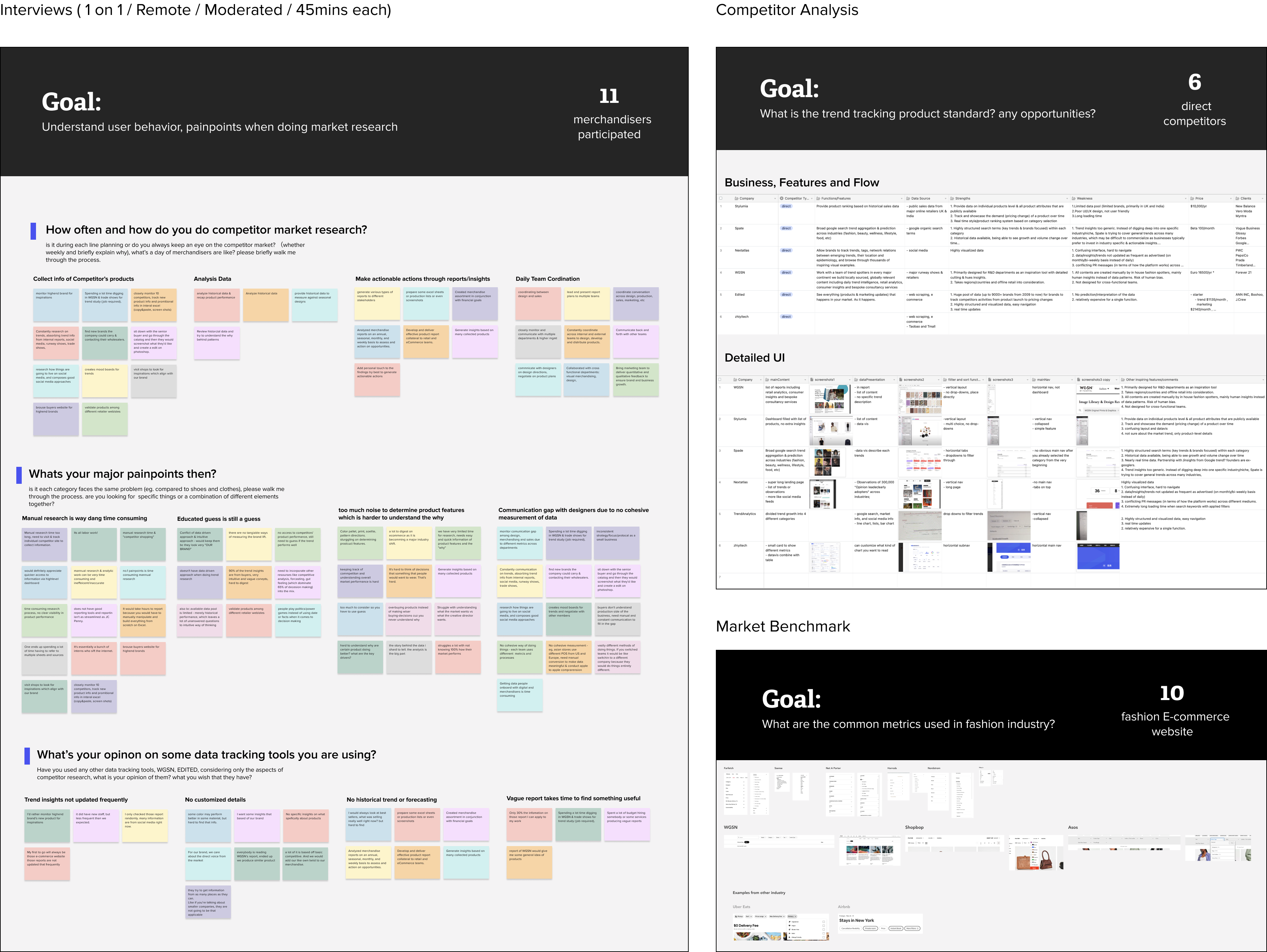
Next, I applied different research approaches to further understand the problem. Each research approach has its own specific goals. For interviews, I drafted user interview questions and I conducted competitive analysis. I also studied the layout and filters of several well-known e-commerce sites.
🤯
Too much information to form a whole picture
98% of them specify that decision making requires a lot to combine
"a lot to consider, Color pallet, print, silhouette, pattern directions. struggling on determining product features."
😩
Conflict of data driven approach & intuitive approach
90% of them claim that decision making always requires guesswork
" Educated guess is still a guess, which leaves a lot of unanswered questions to intuitive way of thinking"
😱
Time sensitive to understand the market
83% of them struggles a lot with analyzing data quickly
We have very limited time for research, needs easy and quick information of product features
😵
Hard to get insights that can benefit my brand particularly
76% participants digging into other vague or broad trend report for insights
"Spending a lot time digging in WGSN & trade shows for trend study
"Only 30% the infomation on those report I can apply to my work"
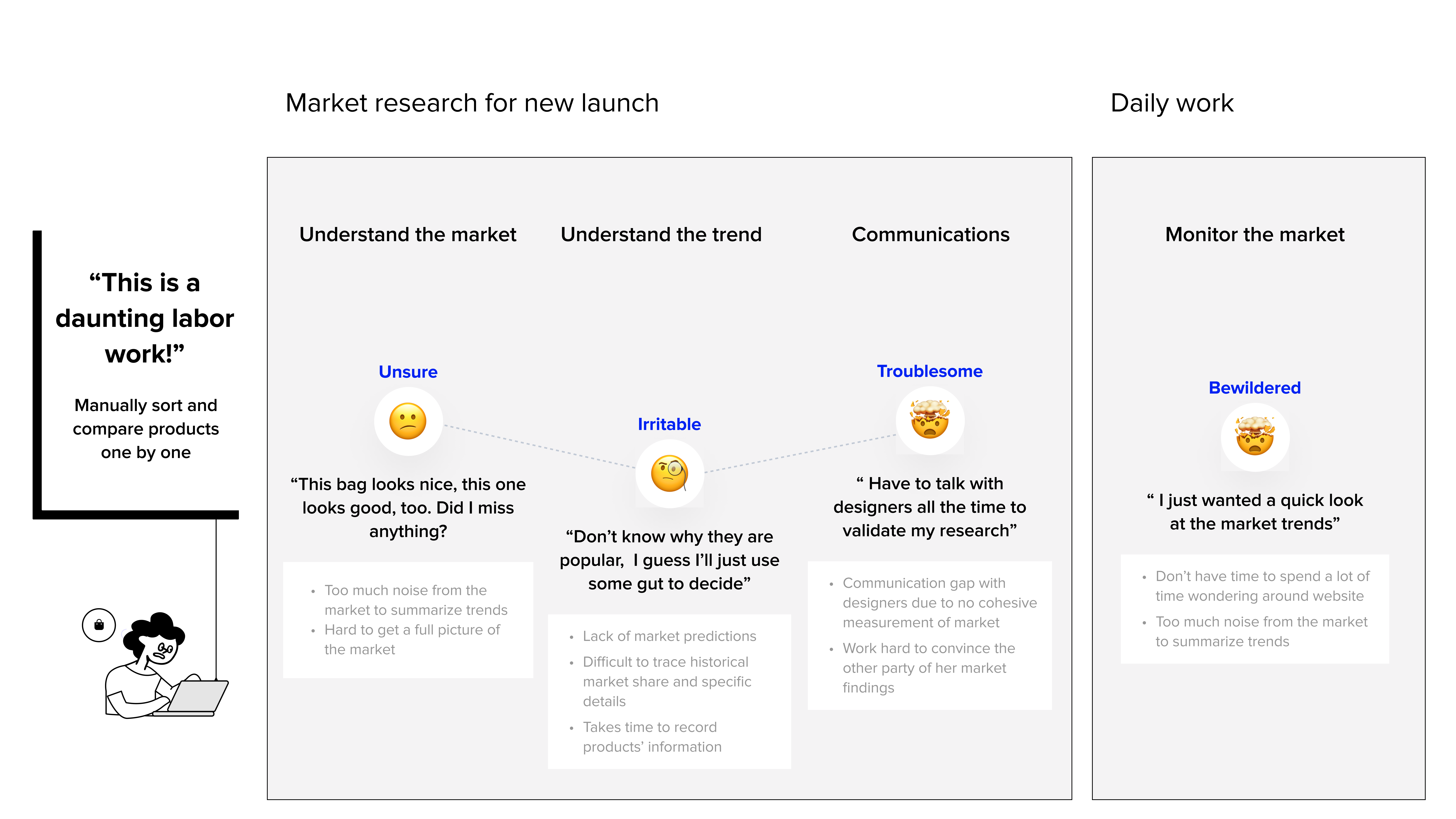
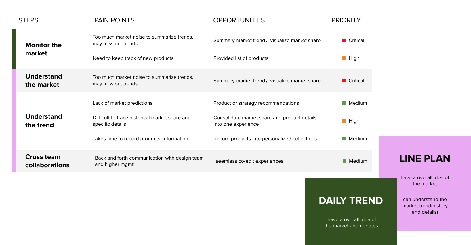
After the research, we learned about the merchandiser group. I composed two scenarios to visualize the task they are facing and where our design has potential to help.
At the same time, we came together to more concretely visualize where the pain points of merchandisers during the two scenerios are focused. I created this map to visualize the current flow which helps facilitate everyone’s understanding of the pain points and opportunities
For Merchandisers who work for small to medium-sized fast fashion companies, they need a more intuitive and customizable method to monitor market trends, because the current manual research is very time-consuming, and too much noise from the market to pull together actionable insights
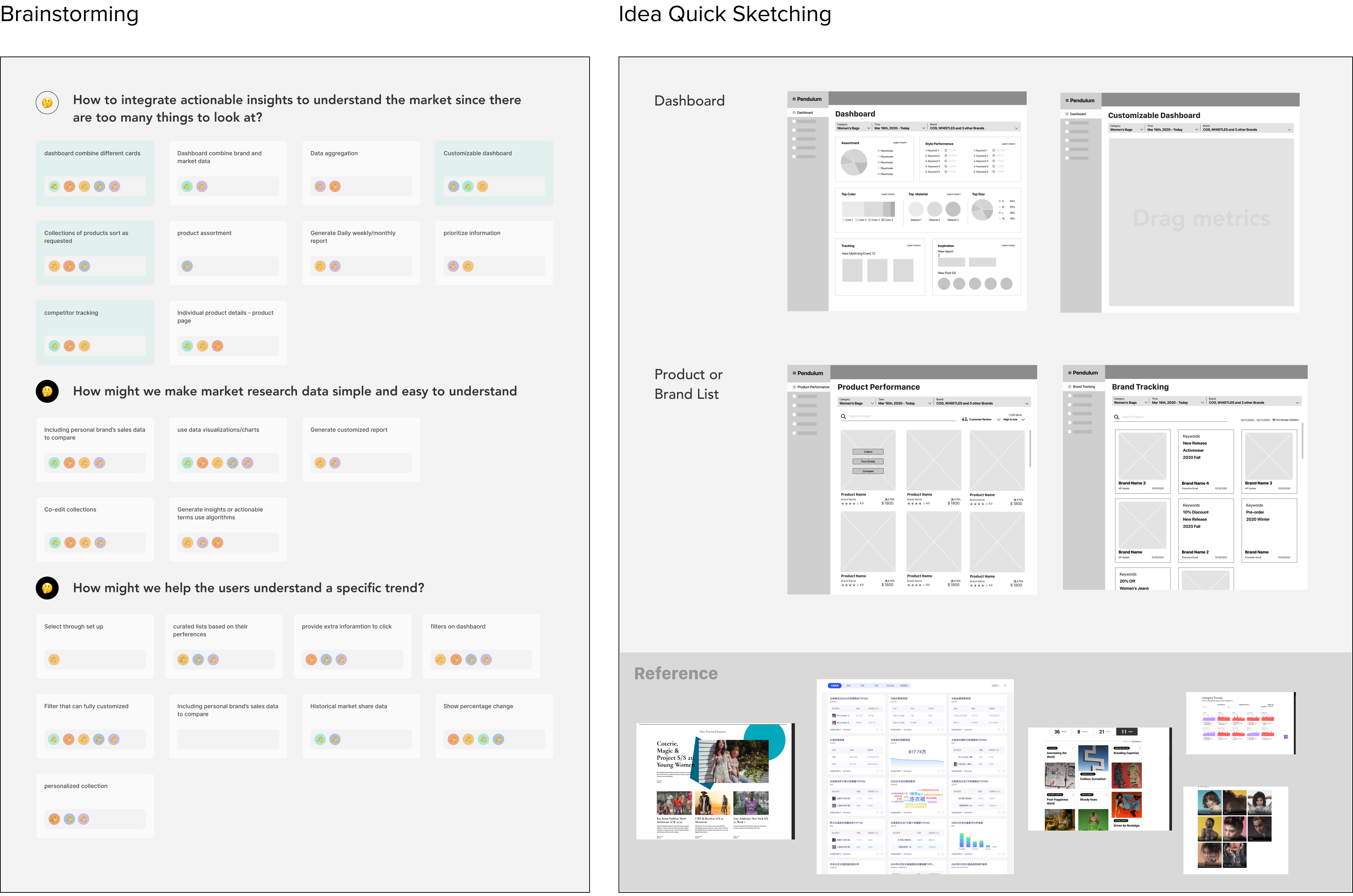
With this in mind, I first ran a brainstorming session that listed solutions and opportunities that involved everyone to make a plan. I listed the design opportunities in sequence, prioritize main opportunities that can be addressed in this round of design.
🤔
Understand the overview market
How to integrate insights for the overview market since there are too many things to look at?
🥺
Understand the detailed trend
How to help to understand a particular trend framed around their own needs?
I then invited the team through a brainstorming session to list potential solutions. We debated if dashboard is necessary or we should use a product list or a report list which provides direct product inspirations.
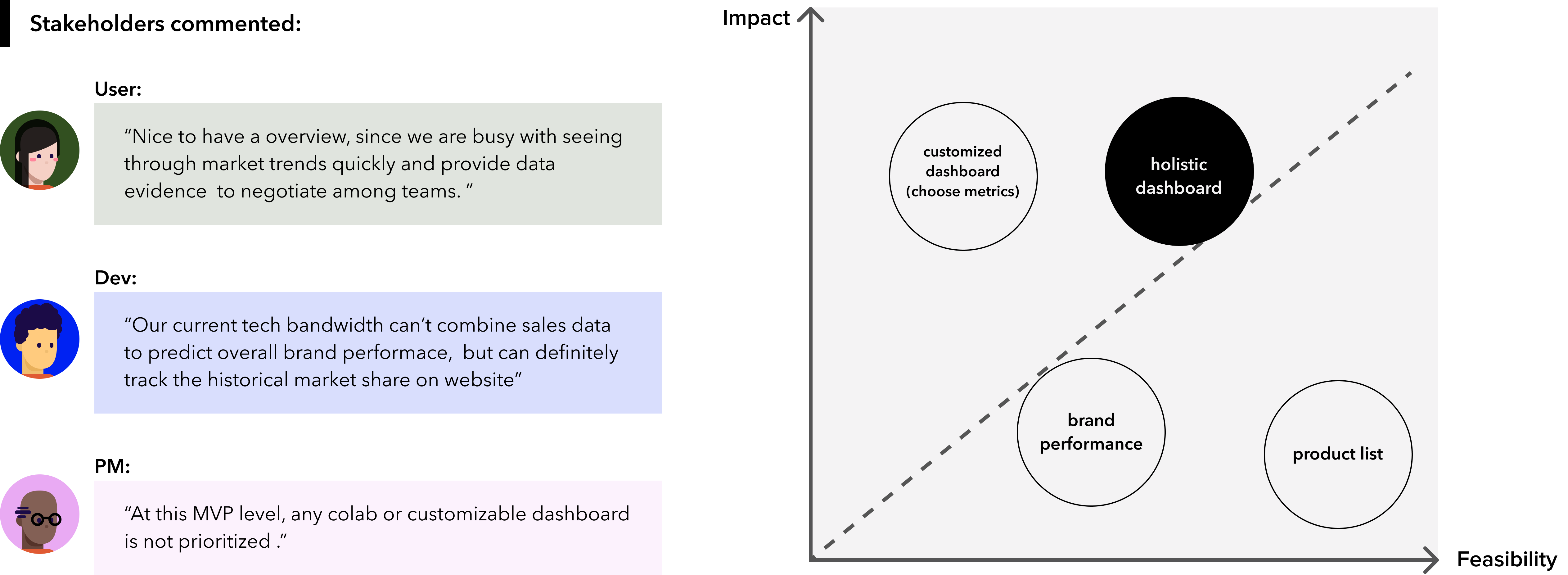
Considering user needs, business goals, tech and time constraints, we decided to design a holistic dashboard with a “ learn more” page to provide more data-driven information before we move to build up some fancy collaboration features.
Organized
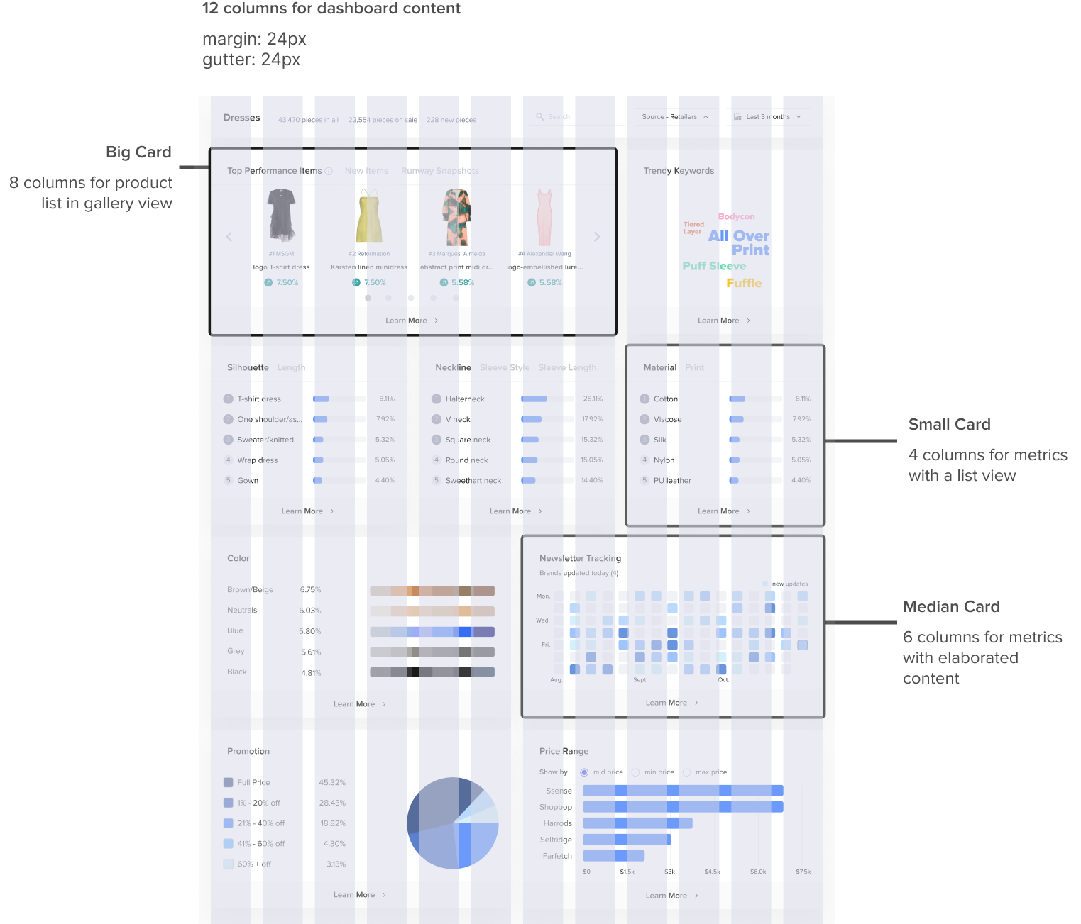
Define the layout logically, prioritize the content in order.
Focused
Focus on key information instead of display all
Accurate
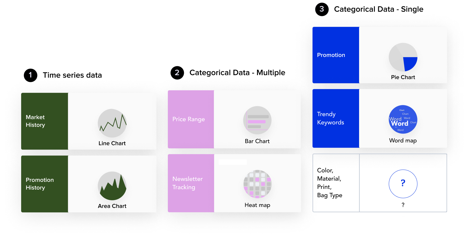
Keep data accuracy, clarity and completeness. Remember to Use the correct types of charts. and Explain data definition when necessary.
Scalable
The dashboard design should be able to adapt to the broader fashion genre
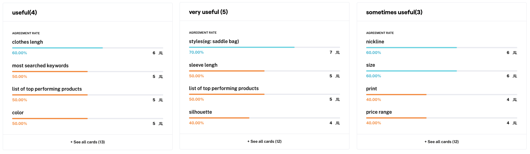
I mapped out possible options for the dashboard and its detail pages and focused on the contents’ structure first. I had frequent working sessions with other stakeholders to absorb and evaluate their feedback. By wire-framing the dashboard and learn-more pages multiple times, There are updates everywhere including layout, visualizations, and filter details respectively. Below are just a few out of hundreds.
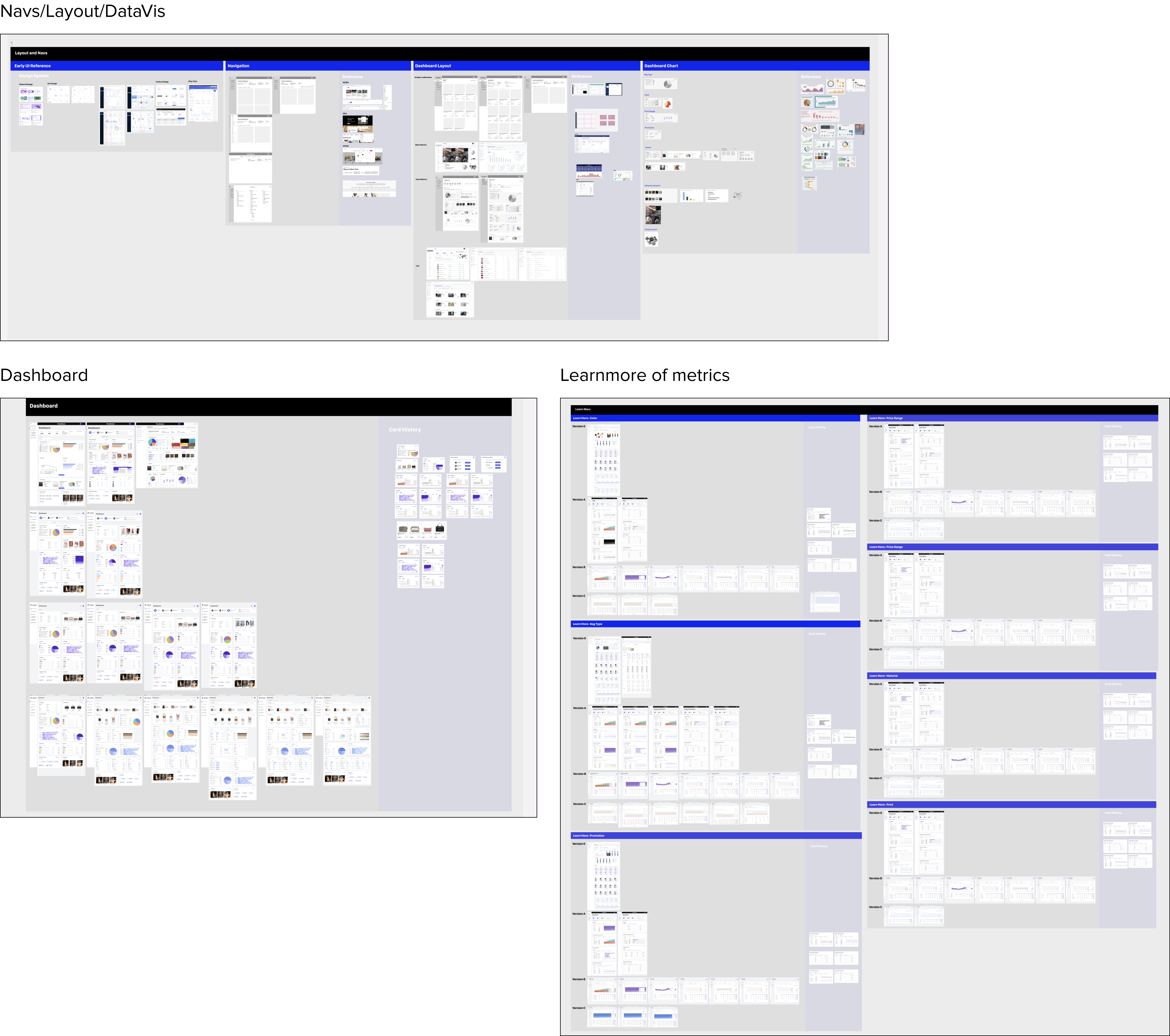
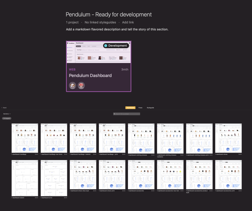
This is the roadmap with things to design in sequence. Start from dashboard to Learn-more page, from overview to details. This following part will mainly introduce how I designed the dashboard. Here are solutions explained by 3 stories:
Should we “Quickly place some hand bag's numbers and charts”?
How to create spaces for that many contents?
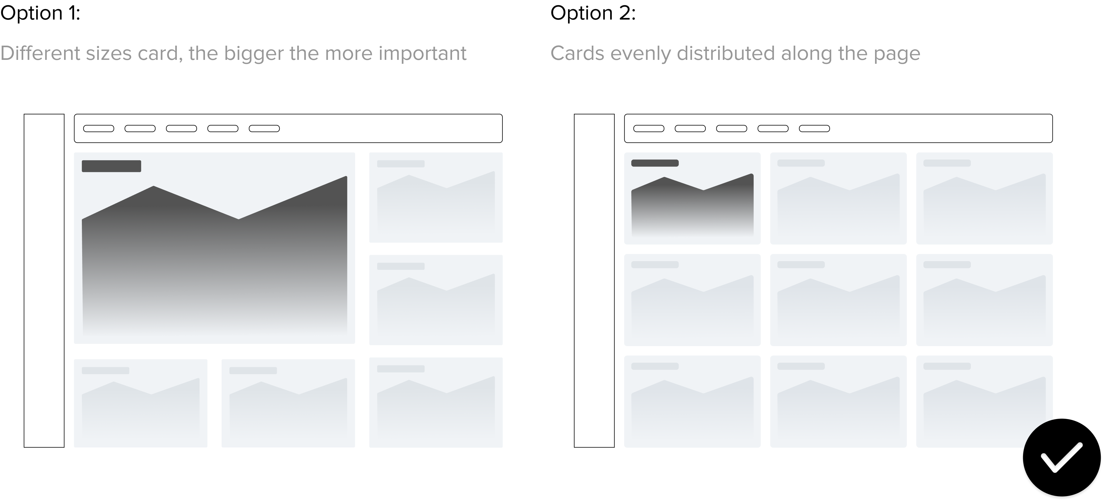
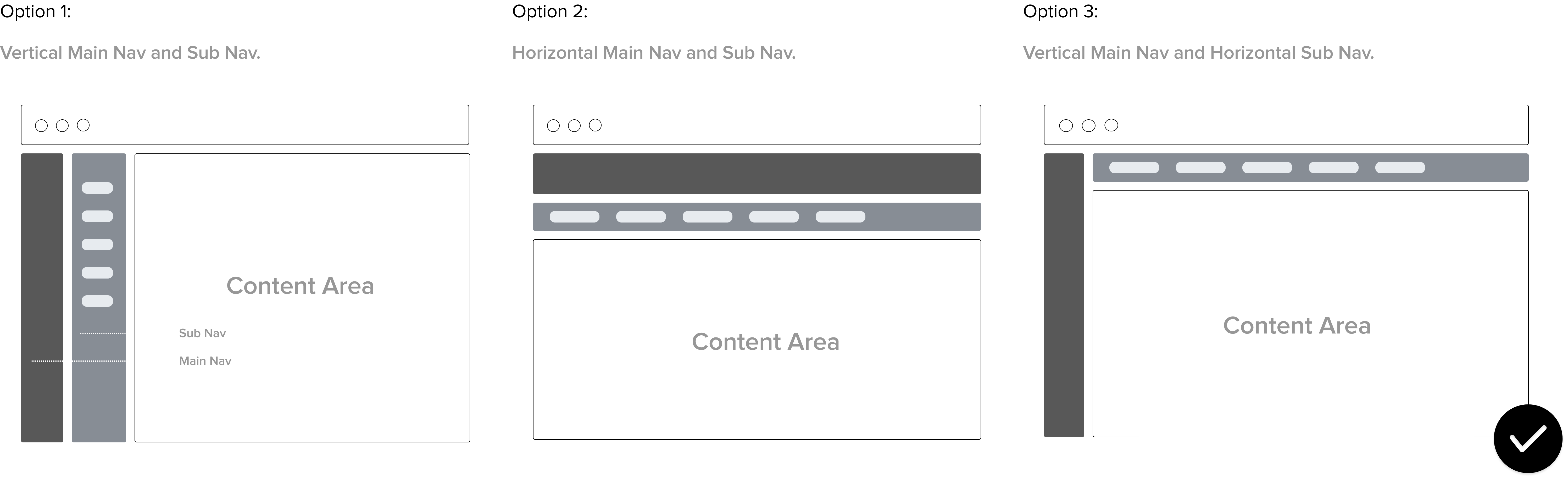
If no fancy charts then what's wrong with a vanilla pie chart?
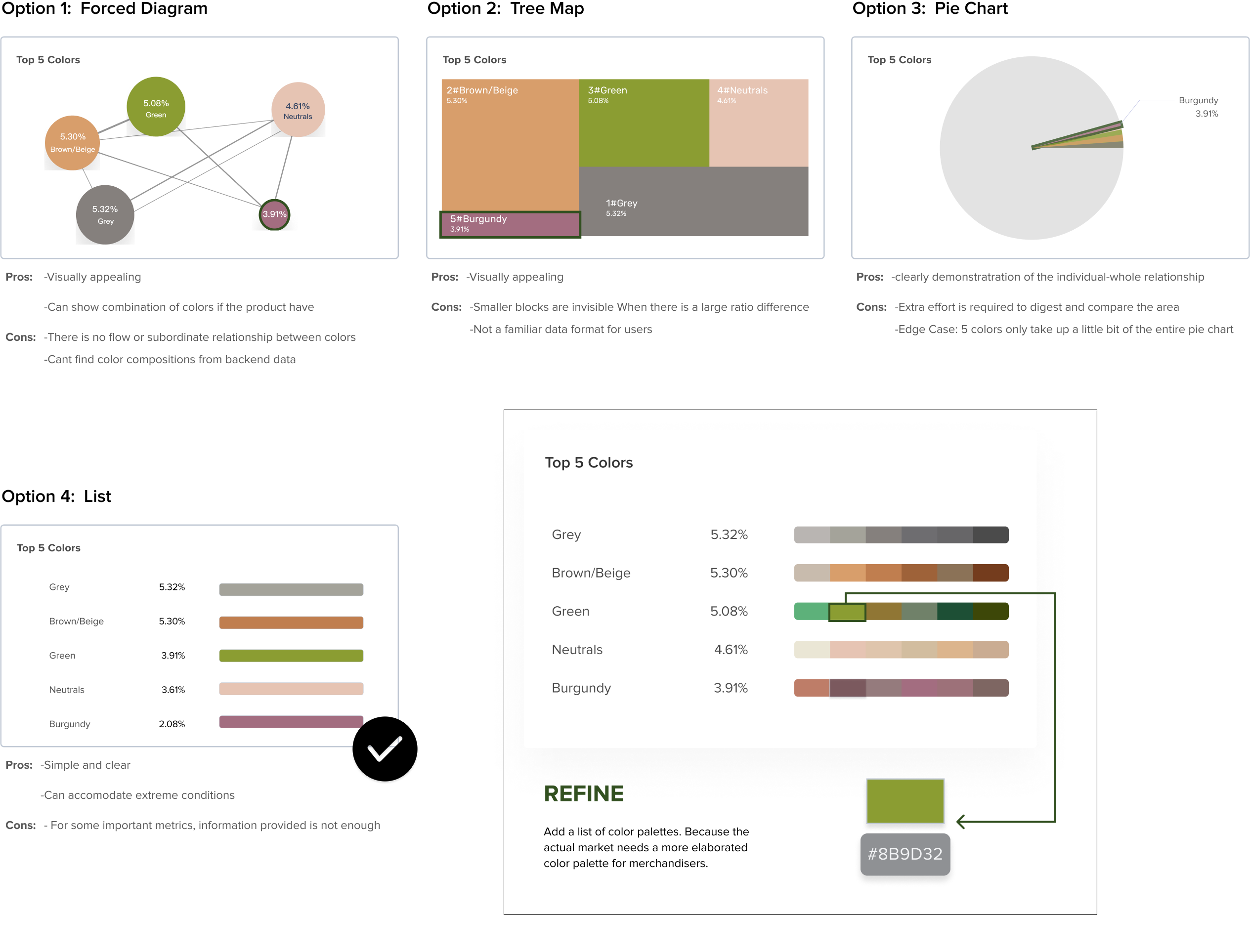
Though happily known that we are on the right track of problem solving, we quickly found that this dashboard is not that efficient in terms of information display.
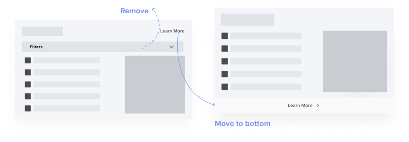


This flow is mainly the optimization for information display that experience many rounds of back and forth. Details rationale can be found at the link below
Currently in the mvp stage there is no demand on the mobile side, but I have considered the size of different monitors to make a dynamic responsive page.
I initiated the creation of the design library, please see here for details
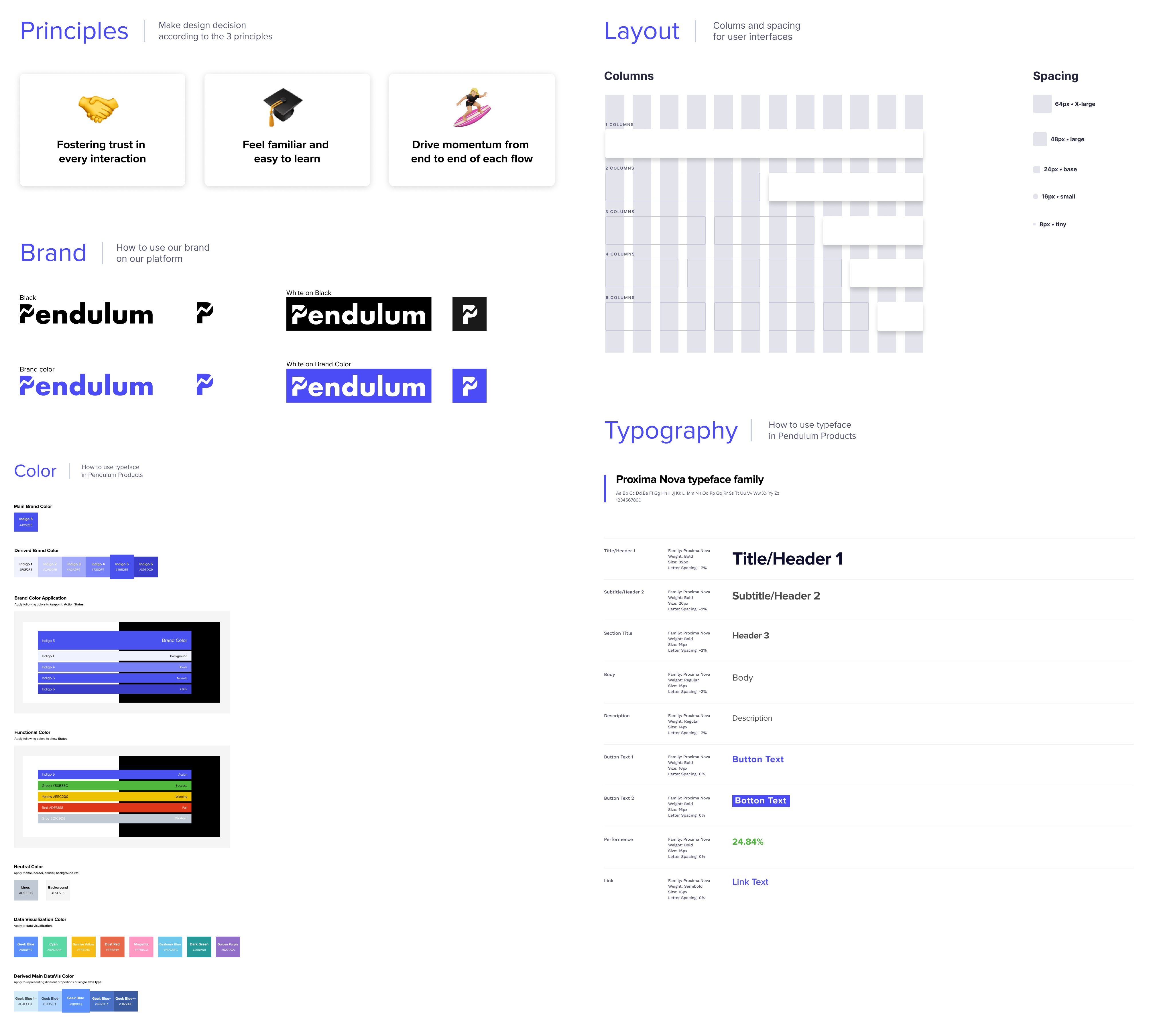
Previously, the designs were all in one file. I organized them by feature, recorded the process clearly, and kept the latest designs in one page for easy handover to the dev team. And I took advantage of new tools such as zeplin to provide full specs
Figma to point out users flows, specs, status and links to other design resources
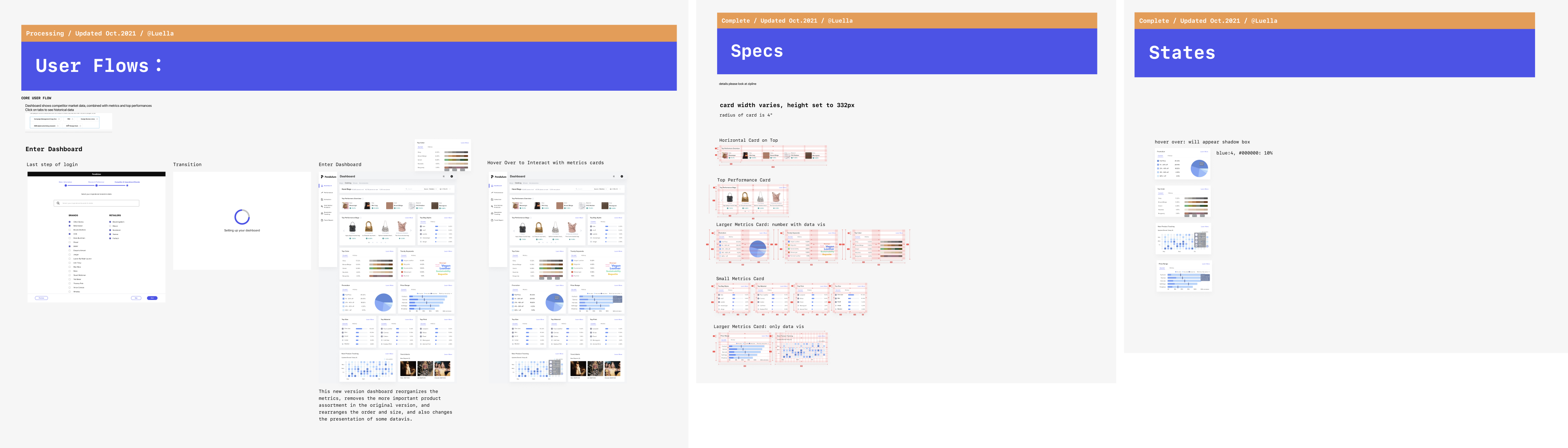
Zeplin to give detailed specs
I also prepared skeleton screens as transitions when loading data.
Unlike previous data vis projects, this project required me to balance business value, dev efficiency and design stategy from 0-1, and I encountered many problems at first.
⛰ Steep learning curve to understand fast fashion ecology
😵 New product with definition/feature/navigation opaqueness
🤦♀️ Unorganized research resources
🚫 Wide design space from PM’s requirements
At the same time, as a whole remote team, it caused me some problems at first. Here are some of my main takeaways
Deal with limitations
In the design process, many features or designs need to be adjusted according to the actual situation, this time to learn to communicate with different teams, to clarify the reasons for the problem, whether there is a reason and plan b to validate design. In what case I need to take on design, over all this is design rather than decoration.
Communicate early, often and clearly
Exchanging thoughts with stakeholders mentioned above early and often allowed me to see the limitations faster and adjust my design in time. For example, in the build of learning more, the dev has been struggling for a long time because of the previous version of the design, and later we iterated the design to make the data architecture clearer, if we communicate early, we can reach that sweet point sooner
Achieve impact by building trust
Being a new member in the team, it’s important to show that I care about the team. So when I tried to use some novel methods and asked for resources. For example, I use maze for the usability test combined card sorting in between, I would explain why and keep the supporters updated with progress I made to enhance participation feeling.


Thank you so much for swinging by
Say Hello
2025 (Luella) Qinglu Lu. All rights reserved.