Pendulum, a trend analysis platform enable fast fashion businesses to make product decisions accurately and efficiently
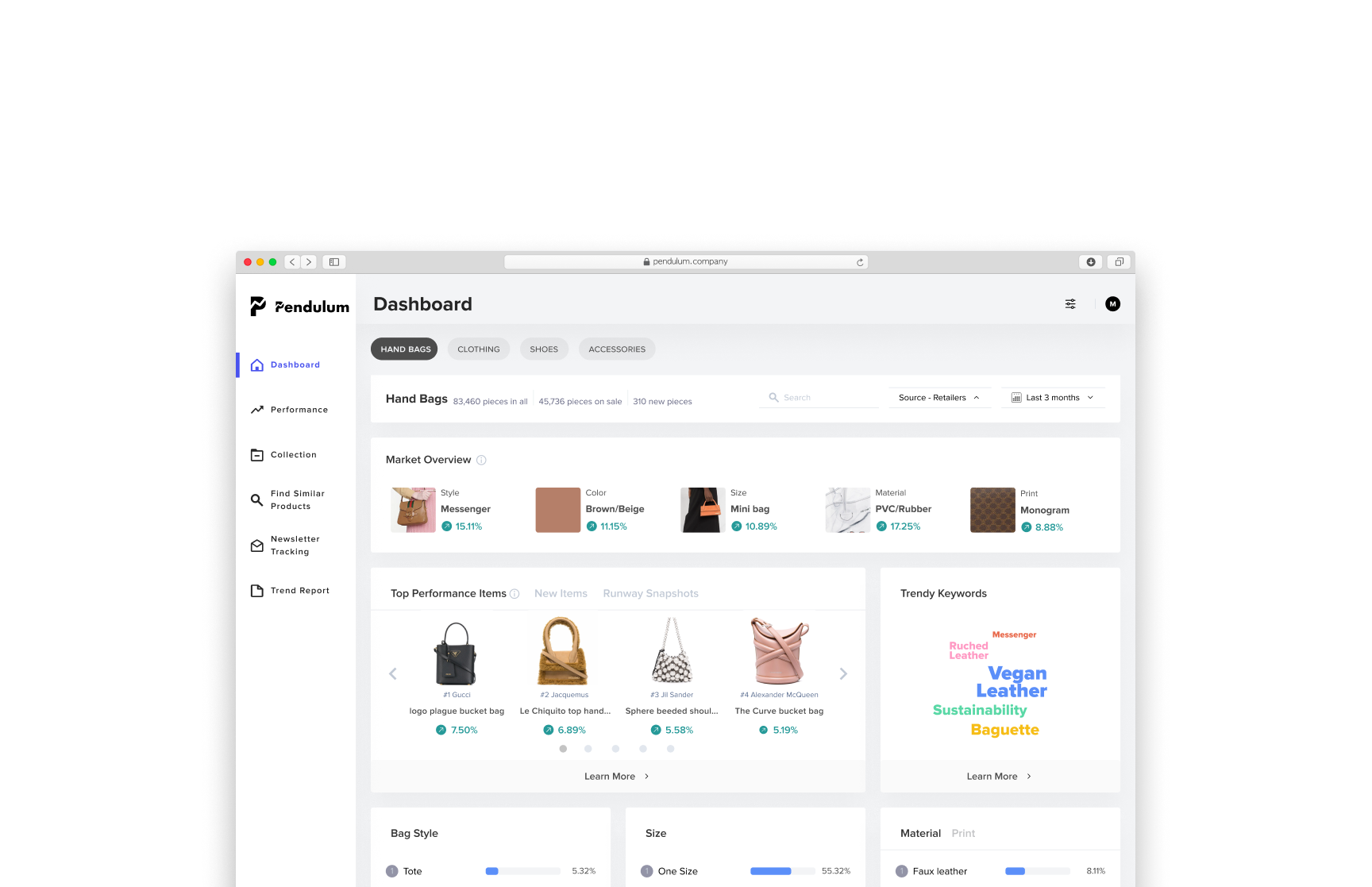
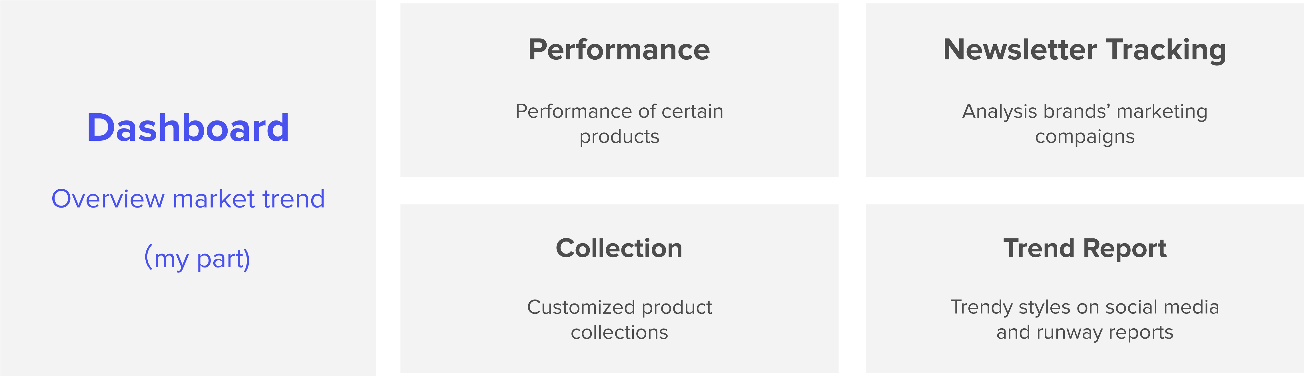
Transforming traditionally cumbersome excel tables into a powerful tool, Pendulum has iterated through a lot of validations, and explorations to develop this end-to-end market trend analyzing experience. This project is an elaboration of the dashboard design. For more research details please click below.
Impact of our dashboard's design incorporates:
For Merchandisers who work for small to medium-sized fast fashion companies, there is a need for a efficient and customizable method to monitor market trends. because the current manual research is very time-consuming, and is polluted by too much market noise to put together actionable insights

🥺
Understand the detailed trend
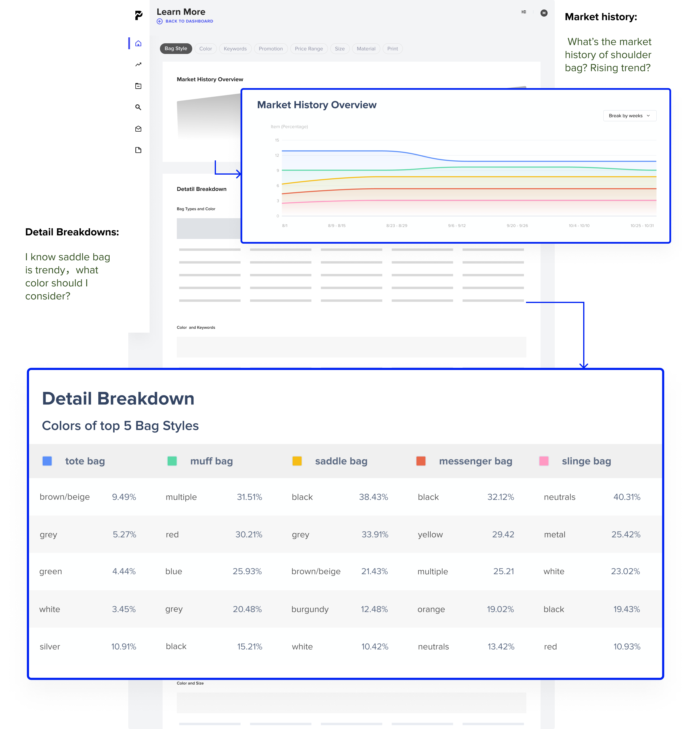
How to help to understand a particular trend framed around their own needs?
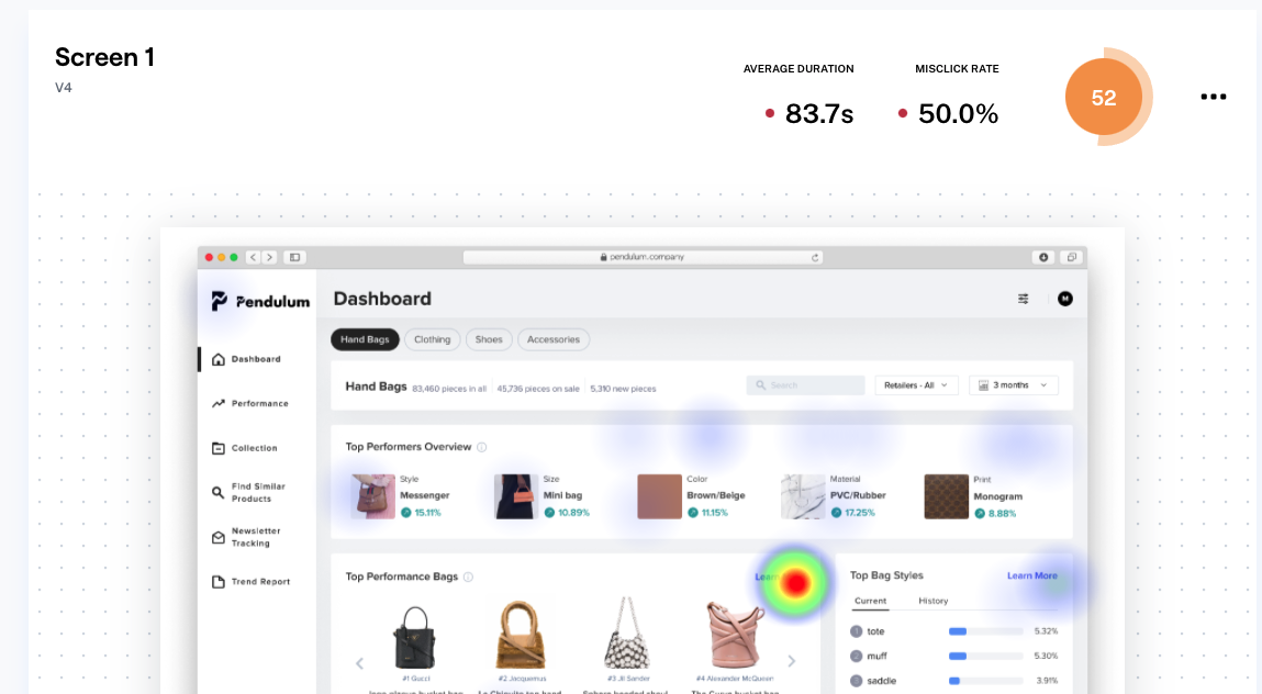
Merchandisers often complain that the current trend reports on the market are too vague, and merchandisers often struggle with how to find specific trends and understand the trends. So the learn more page provides the dashboard with market history and details breakdown:
blabla
Give flexibility back to merchandisers

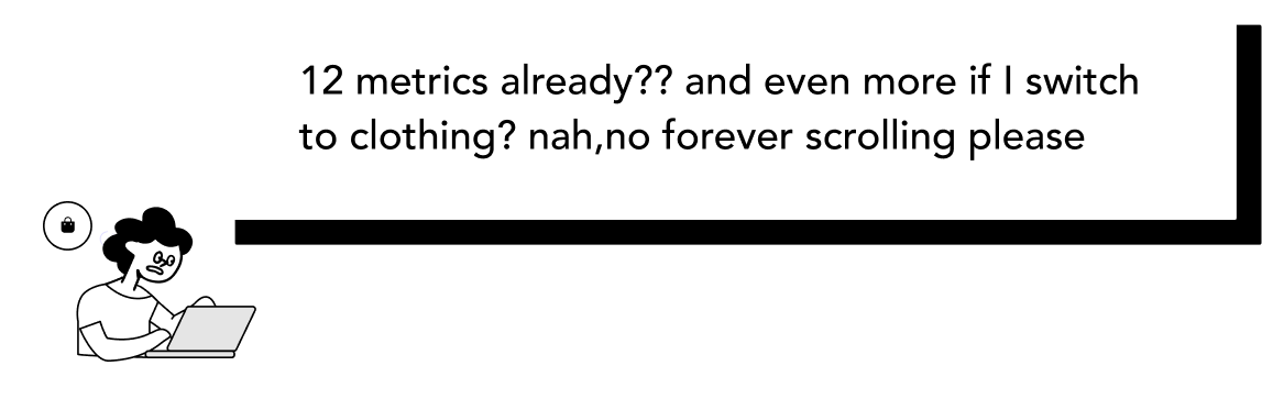
More use cases doesnt mean its good


blabla


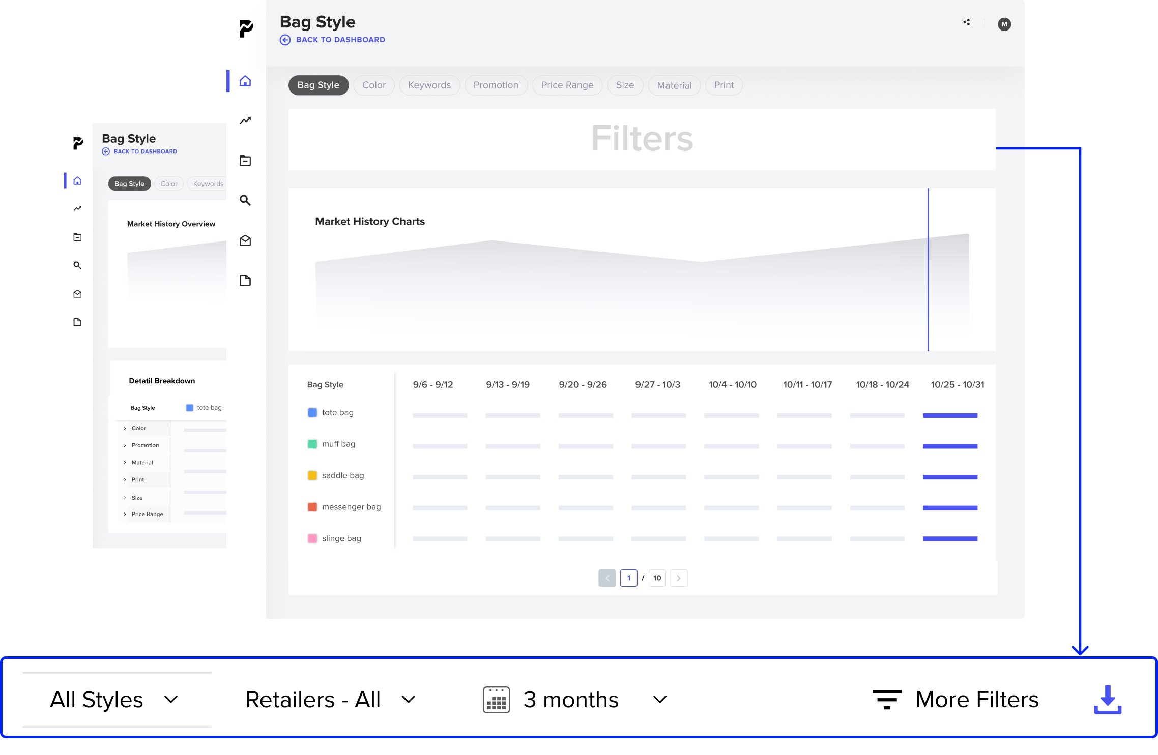
Previously, the designs were all in one file. I organized them by feature, recorded the process clearly, and kept the latest designs in one page for easy handover to the dev team.

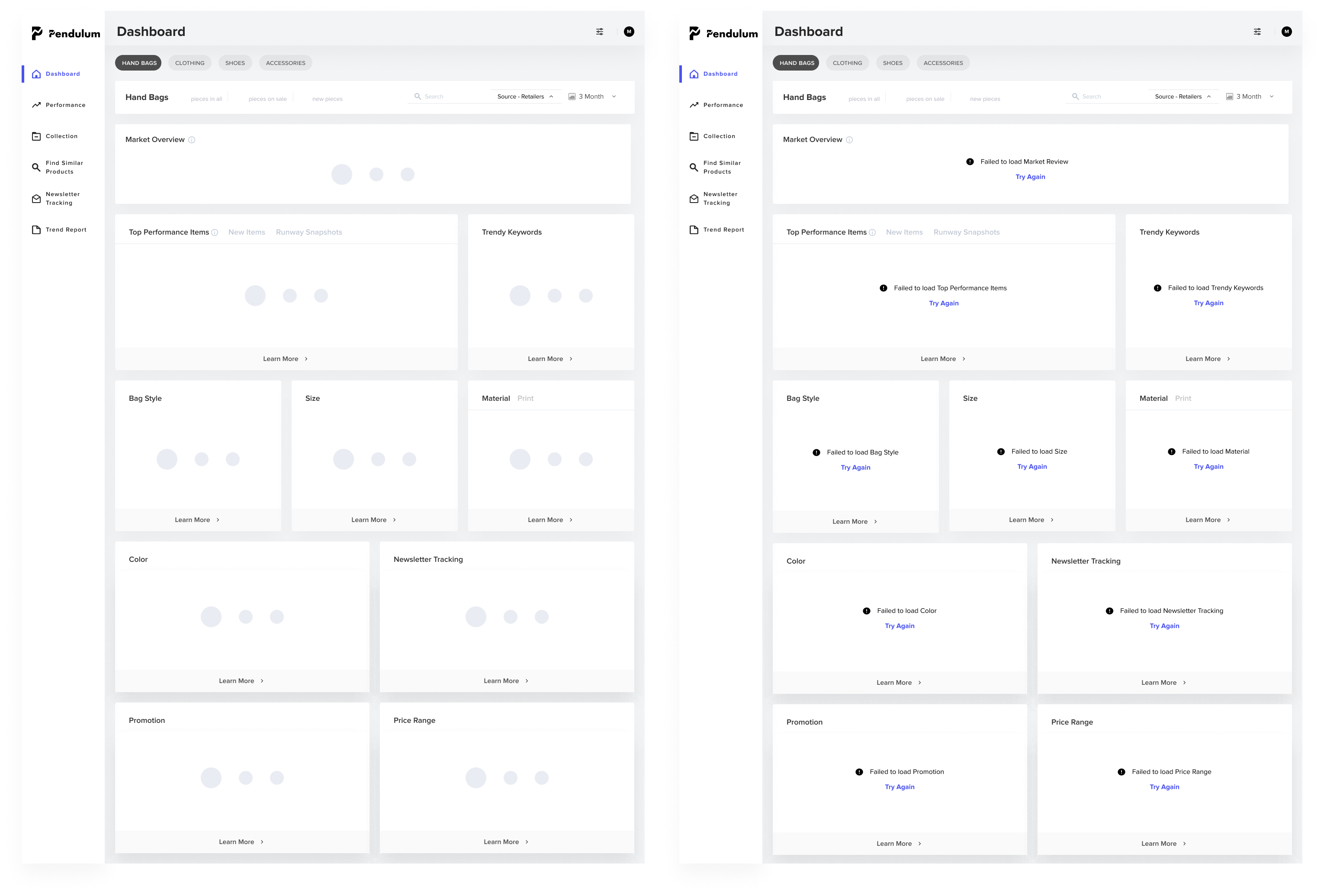
I also prepared skeleton screens as transitions when loading data.
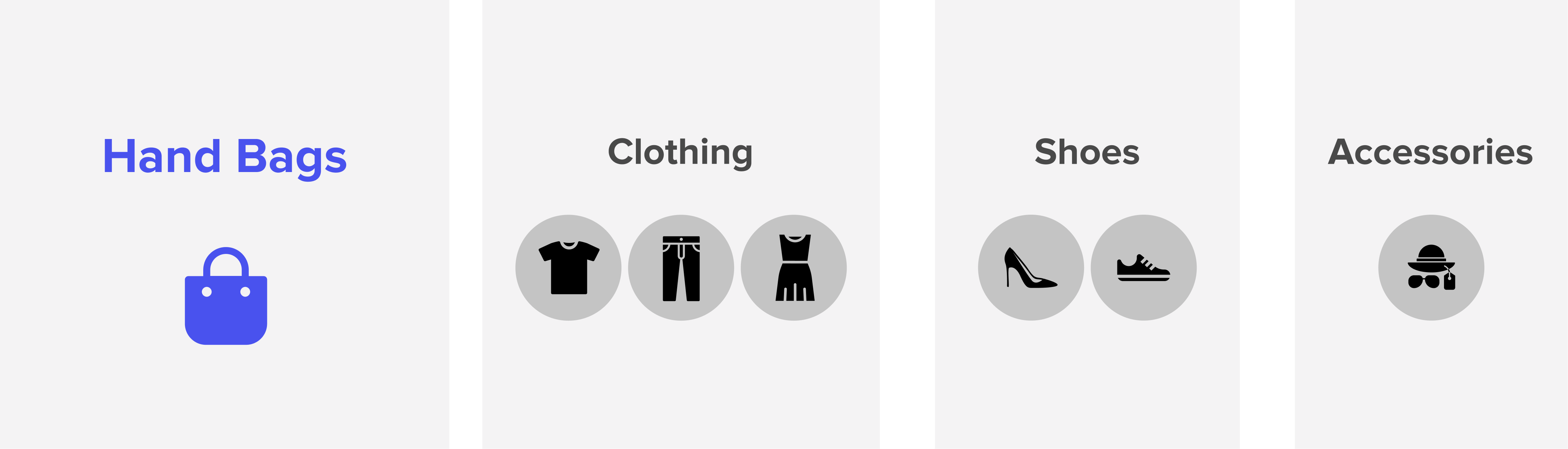
particular needs, product collections
Unlike previous data vis projects, this project required me to balance business value, dev efficiency and design stategy from 0-1, and I encountered many problems at first.
⛰ Steep learning curve to understand fast fashion ecology
😵 New product with definition/feature/navigation opaqueness
🤦♀️ Unorganized research resources
🚫 Wide design space from PM’s requirements
At the same time, as a whole remote team, it caused me some problems at first. Here are some of my main takeaways
Deal with limitations
In the design process, many features or designs need to be adjusted according to the actual situation, this time to learn to communicate with different teams, to clarify the reasons for the problem, whether there is a reason and plan b to validate design. In what case I need to take on design, over all this is design rather than decoration.
Communicate early, often and clearly
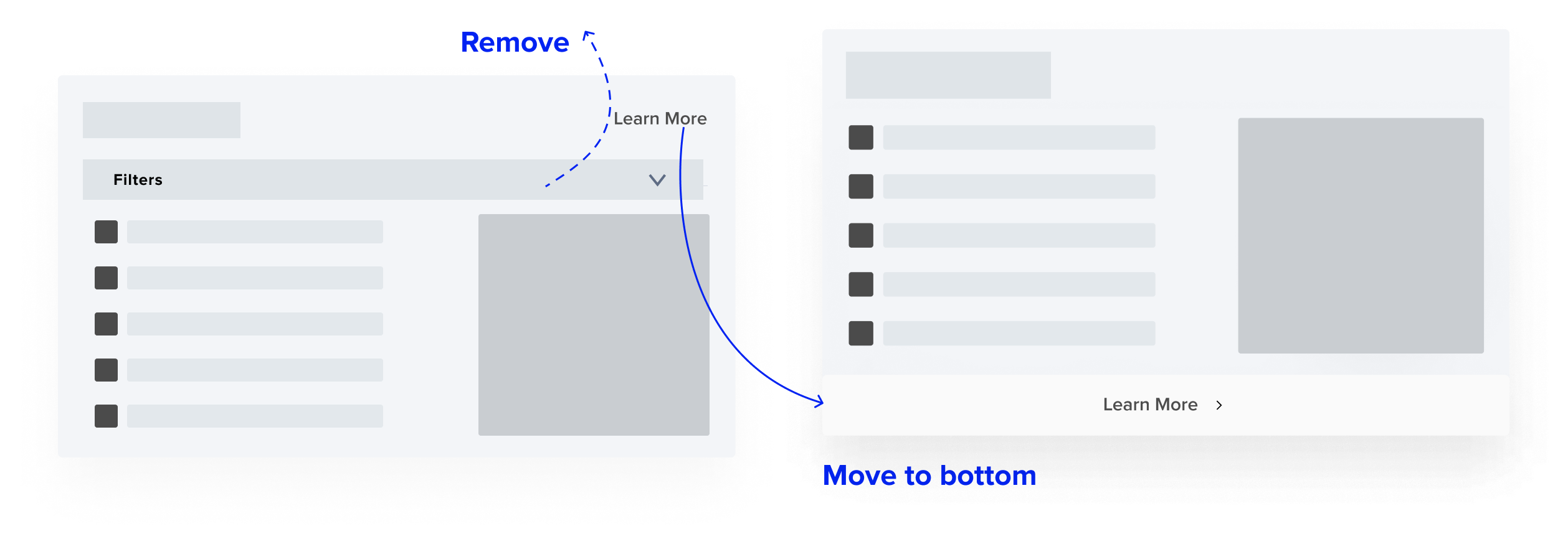
Exchanging thoughts with stakeholders mentioned above early and often allowed me to see the limitations faster and adjust my design in time. For example, in the build of learning more, the dev has been struggling for a long time because of the previous version of the design, and later we iterated the design to make the data architecture clearer, if we communicate early, we can reach that sweet point sooner
Achieve impact by building trust
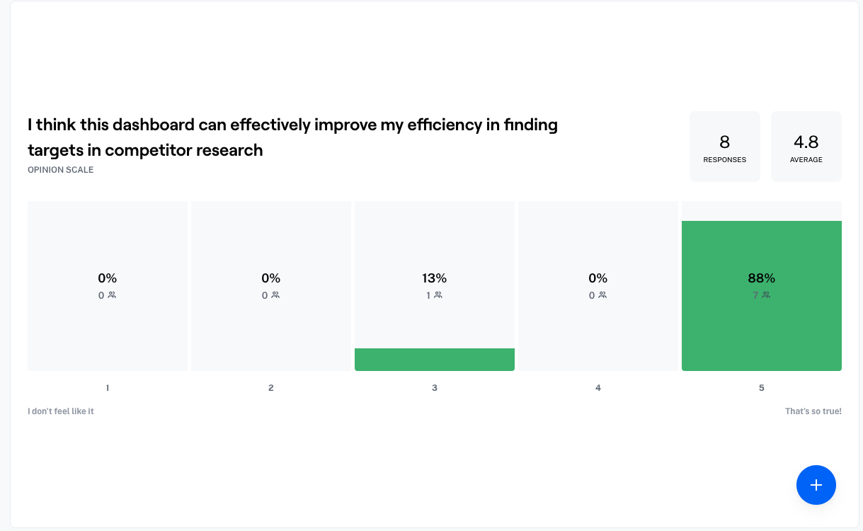
Being a new member in the team, it’s important to show that I care about the team. So when I tried to use some novel methods and asked for resources. For example, I use maze for the usability test combined card sorting in between, I would explain why and keep the supporters updated with progress I made to enhance participation feeling.


Thank you so much for swinging by
Say Hello
2025 (Luella) Qinglu Lu. All rights reserved.